Pages

Sunday, 4 December 2016

Introducing Histograms


In grade 8 in Ontario histograms are one of the new data management topics. Below is a series of activities that range from paper & pencil to virtual manipulatives. They start by a simple comparison of bar graphs and histograms to identify characteristics, then moves to some consolidation of ideas using a Desmos Sort. Then some data collection of student heights to formally introduce creating a histogram followed by some practice making histograms by hand and then with Google Sheets. If you did everything here it should take about 2-3 classes.

Grade 8
  • collect and organize categorical, discrete, or continuous primary data and secondary data (e.g., electronic data from websites such as E-Stat or Census At Schools), and display the data in charts, tables, and graphs (including histograms and scatter plots) that have appropriate titles, labels (e.g., appropriate units marked on the axes), and scales (e.g., with appropriate increments) that suit the range and distribution of the data, using a variety of tools (e.g., graph paper, spreadsheets, dynamic statistical software); 
  • select an appropriate type of graph to represent a set of data, graph the data using technology, and justify the choice of graph (i.e., from types of graphs already studied, including histograms and scatter plots);
  • read, interpret, and draw conclusions from primary data (e.g., survey results, measurements, observations) and from secondary data (e.g., election data or temperature data from the newspaper, data from the Internet about lifestyles), presented in charts, tables, and graphs (including frequency tables with intervals, histograms, and scatter plots);
  • demonstrate an understanding of the appropriate uses of bar graphs and histograms by comparing their characteristics
  • Could also be used as a review in MBF3C or MDM4U
  • If you are doing the physical card sort then print graphs to card stock (we suggest each set is a different colour so that if students mix them up they are easy to separate). We also suggest lamination. There are two pages for a total of 16 cards. 
  • If you are doing any of the online activities then chromebooks/laptops/computers/iPads will be needed. You will also need to make copies of the Desmos version of the card sort and/or the Desmos card sort consolidation.
  • Copies of the handout
  1. The purpose of the card sort is to start to distinguish both histograms and bar graphs and continuous vs categorical data. But first have them do an open sort. Hand out cards to students (or give students the code for the Desmos Sort). Ask them to sort them in any way they wish. The only stipulations are that there should be at least two groups and each group must have at least two cards. Students will sort them in all kids of ways (by the numbers, by the topics, by the looks). Circulate and encourage them to explain how they were sorted.
  2. Once sorted it is likely that most will not have them sorted how you wish. Have them describe their sorts then ask them to sort them in a way so that there are only two groups. 
  3. By this time some may have them sorted into bar graphs and histograms. If not show one bar graph and then one histogram stating that you want those cards to represent characteristics of each group (you can use the slideshow to show the graphs). Use these graphs to develop the difference between continuous and discrete data.
  4. Time to change the pace and have students collect some data. Have students measure their heights and put them on a dot plot on the board. Use this to create a histogram (without creating a tally). You might want to collect their heights in a spreadsheet so that you can create a histogram with it later. 
  5. Walk through the front of the handout to show how to create a histogram from data. 
  6. Likely you will be at least done one class at this point (if not more). At the beginning of the second class, start with the consolidation Desmos card sort (with some stuff on average) to remind students of continuous and discrete data. Another possible way to start is to have students use this Google form to enter some examples of continuous and discrete data. You can take up the results. 
  7. Once done taking up the worksheet you can then introduce students to creating histograms using Google Sheets. Share this sheet with continuous data. This video will tell you how. 
Did you use this activity? Do you have a way to make it better? If so tell us in the comment section. Thanks 

Monday, 20 June 2016

Developing Derivatives Graphically

In this activity students develop the visual connection between a quadratic function and its derivative. Each student is given a quadratic function and an x value. They are to determine the point and the instantaneous rate of change of their function at that x value. Once they do this they plot their point and then also plot their rate of change (as a point at that x value) on a piece of chart paper. Since everyone is given a different x value, a graph of both the original function and its derivative should be constructed. This would be a good activity to introduce the concept of the derivative shortly after students know how to find the instantaneous rate of change by using a limit.
Once students are done the graphs on the charts, they can then move to extend their thinking with this Desmos activity where they visually estimate the slope of the tangent to eventually build the derivative (based on a original sketch by @eluberoff). As they slide the sliders to estimate each tangent, once they get them all close to where they should be, the derivative appears (see animated gif below)They do this for several simple quadratic functions and (hopefully) see the beginnings of how the power rule works as they move towards simple cubic functions.


  • MCV4U-A2.2 - generate, through investigation using technology, a table of values showing the instantaneous rate of change of a polynomial function, f(x), for various values of x (e.g., construct a tangent to the function, measure its slope, and create a slider or animation to move the point of tangency), graph the ordered pairs, recognize that the graph represents a function called the derivative, f ’(x) or dy/dx , and make connections between the graphs of f(x) and f ’(x) or y and dy/dx
  • A3.1 - verify the power rule for functions of the form f(x) = xn , where n is a natural number
  • Grid chart paper (one per function - write a different function on the top of each piece). You may wish to draw the grid on each piece before hand. Because the scale can get disproportionally large on the y vs x axis you may want to spread the scale out on the x so that it's not so crowded. Note that if you choose to us a disproportionate scale on the chart paper then the kids must use a similar scale in their mini graph papers ( I've done this activity a few times and only now, as we created this post, did we figure out that this is why the slopes of the tangents didn't quite match the graphs physically). 
  • Copies of each mini graph for each student via the handout (see image to the right for a sample). There are four functions (f(x) = 1/4x2, f(x) = 1/2x2, f(x) = x2, and f(x) = 2x2) and potentially nine x values for each function (-4, -3, ....3, 4). You may not want to give out the -4 or 4 for the f(x) = 2x2 function as it requires a big y axis scale. Depending on how big your class is, you may not want to hand out all of the mini graph sheets. For example, if you had 25 students you might want to use 3 of the functions. Cut these out ahead of time. You may wish to have more than you need ready so that if someone finished quickly, they can be given another one. 
  • Scotch tape for students to stick their graphs on the chart paper.
  • Markers. Preferably different colours (one colour for the function points, derivative points, function line, derivative line and tangent lines).
  • Laptops, Chromebooks, iPads if you will be extending this to the Desmos version
  • Place chart paper on the walls and distribute one mini graph to each student. Make sure there is enough of each function so that the shape will be visible
  • Each student then does the following:
  1. Determine the point on that function at that x value: A(     ,      )
  2. Determine the slope of the tangent at that x value for your function: Slope of tangent = _____
  3. On your mini graph, draw a line with the same slope as the slope you just calculated and going through the middle point on the mini graph
  4. Plot the point from #1 on the large graph. Stick your mini graph on the large graph paper so the point on the mini graph paper is on top of the point you just plotted (be careful with your orientation)
  5. Plot a second point that has your x value and its y value is the slope of your tangent: B(   ,   )
  • As students plot their points by sticking their mini graphs on the chart paper, you may wish to use the markers to draw over their points and lines to make them more visible. Note: If a student makes a mistake, do not correct it right away (or make it permanent with a marker). Instead ask students if they think anything is out of place either at the time or during the consolidation
  • Once all the graphs are done consolidate the ideas
  • Once consolidated then move to the Desmos activity. If you have not done a Desmos activity before you might like to watch some of these tutorials first: Navigating, starting an activity, and teacher dashboard.
  • Note that it is not necessary for students to get all the way through the activity. As long as they get through the quadratics. The cubical are the extension. The whole idea behind this is they discover the power rule.
Did you use this activity? Do you have a way to make it better? If so tell us in the comment section. Thanks

Monday, 6 June 2016

Derivative Matching Cards

This is a very simple matching activity for Calculus. Students are give a set of cards with either a linear, quadratic or cubic function on them. Their job is to pair them up so that one is a function and the other is its derivative. There are a total of 12 functions with 12 derivatives. The first six are all linear or quadratic graphs and the second six are either quadratic or cubic graphs (if you wanted to give students an easier set you could only give them the first six). This is not meant to be a brain buster of an activity but it does help to solidify thinking in terms of the characteristics of the connections between a function and its derivative.
NEW: Desmos has turned this activity into one of their new CardSort activities. You can get that version here

  • MCV4U - A2.2 - generate, through investigation using technology, a table of values showing the instantaneous rate of change of a polynomial function, f(x), for various values of x (e.g., construct a tangent to the function, measure its slope, and create a slider or animation to move the point of tangency), graph the ordered pairs, recognize that the graph represents a function called the derivative, f ’(x) or , and make connections between the graphs of f(x) and f ’(x) or y and dy/dx
  • MCV4U - B1.1 - sketch the graph of a derivative function, given the graph of a function that is continuous over an interval, and recognize points of inflection of the given function (i.e., points at which the concavity changes)
  • As mentioned above, there are 12 cards and their derivatives but you could break them up into sets of 6 cards and their derivatives where the first set was made of linear and quadratic functions and the second set is made of quadratic and cubic functions (or you could just put them all together). On each page there are six graphs. The first column are the functions and the second column are the matching derivatives.
  • Print the sheets out on card stock (and laminate if possible). We tend to print each set out on different colours. This way if they get mixed up all you need to do is collect 24 cards of one colour and you will know you have a full set
  • You may also want to print a copy of the teacher answer key which has all 24 graphs on one page so you can easily check student's answers.
  • Put students in groups of two or three
  • Distribute cards and tell them they have to pair the cards up in terms of a function its derivative. 
  • Instruct them that every card is paired up and they will likely be correct if they have no cards left over
  • Encourage them to use properties of functions and derivatives (zeros, max/mins etc) to speed up the process 

Did you use this activity? Do you have a way to make it better? If so tell us in the comment section. Thanks 

Monday, 4 April 2016

Rate of Change Continuum

A continuum is something where the level difficulty increases in incremental steps. In this case the continuum is dealing with calculating the rate of change (slope) of a linear relationship.
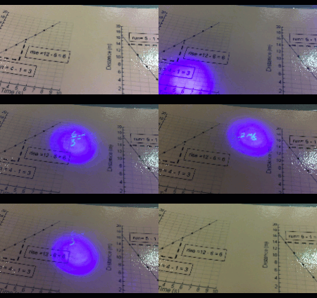
We have previously posted a continuum for solving equations here and here but this one is a bit different. This one has five levels of determining the rate of change from a graph (in context) for a linear relationship. The first level shows lattice points, a rate triangle and the calculation of both rise and run (super basic) and the difficulty increases with each level (see below) until the last level where there is only a scale with no grid lines (so the answer is more of an estimate).

Each page has 6 graphs and students (once they choose the level to start with) choose to answer any three. If they do so correctly then they can move to the next level. The To make things a bit more fun, rather than check the answers with you, we suggest using a UV pen and ink written on the question cards for students to check.
This activity is probably best meant as a consolidation. Note that the expectation is about investigating so hopefully students will have had a chance to develop their own strategies for determining the rate of change. This activity just helps to scaffold it a bit in case they are having trouble (Eg a common mistake that students make when determining the rate of change when the line is in context is to just count boxes for the rise and run without considering the scale).
Note that we also have an Explain Everything version if you have students who have iPads (you may even want to try out the new Explain Everything Collaborative Whiteboard app to have students work in groups from different devices).

  • MPM1D, MFM1P - determine, through investigation, connections among the representations of a constant rate of change of a linear relation.
  • 20 copies of each of the question cards in different colour cardstock for each level,  laminated (use colours that allow seeing the magic pen writing). Note that you may not need 20 copies of each. Perhaps fewer of the first couple levels and last level as most kids will probably be starting in the 2nd or 3rd level
  • 3 sets of the answer cards (use magic pen to write the answers anywhere along each equation, they could be sideways, upside-down, (the answers are on the last page of the Google Doc). To help distinguish the answer cards to the question cards you should put a stamp or sticker on the back.
  • 3 "magic" pens can be purchased at Chapters/Indigo or we found these at a Scholastic's book fair. We have since purchased some on eBay.

  1. For this activity to be successful, students must start at the appropriate envelope. If they start in one that is too hard they will be frustrated and if they start in one that is too easy they will be bored. Use an exit card (the day before) to help you decide which envelope each student should start in. When given back the exit card write down the level they will start in. 
  2. Place the questions in piles in order of difficulty and set up three stations for the answer cards. Students will get a card and answer any 3 questions. 
  3. To check their answers, they will go to a station and use the magic pens. Students may decide to do one question at a time and then go check their answer or they may do all 3 and then check. Students are monitoring themselves so they decide. If they get the first 3 right, they have a level of mastery to move themselves to the next level. If not there are more questions on the card until they master that type. 
  4. As they move through the continuum, the hope is that they reach level 4 which matches the grade 9 curriculum. Since our goal is to get them to level 4, students should solve ALL equations on that card instead of just three. 
  5. The fifth level is set up to challenge students who are moving forward quickly. They should solve all questions on this card. They require some estimation and so answers that students get should be approximate. 
Note that for the Explain Everything version, there are still 6 possible graphs for each level but only two on each page. And to check the answer, slide the black ellipse to either the bottom left or right corner. 
Did you use this activity? Do you have a way to make it better? If so tell us in the comment section. Thanks

Sunday, 28 February 2016

Geometer's Sketchpad - Trig Ratio Generator

When using the Geometer's Sketchpad (for both computer and iPad) it is often better to "start from sketch, not from scratch". That is, give students a premade sketch rather having them build something from nothing (as many textbooks would have you do).
In this activity, students can practice two very specific skills dealing with trigonometry. The first is simply being able to correctly place the names of the sides of a right triangle (opposite, adjacent and hypotenuse). Students drag the side names and then can check their answers and then randomly generate another triangle to try again. The second is one where a random triangle is generated that shows information about two sides and one angle. Students then drag parts of an equation to create a trig ratio equation. They can check their answer and then randomly generate other right angled triangle to try again. 
This is not meant to be something that a student uses for a long length of time but instead just some quick practice to re enforce the basic ideas from trig ratios.
  • MFM2P, MPM2D - determine, through investigation (e.g., using dynamic geometry software, concrete materials), the relationship between the ratio of two sides in a right triangle and the ratio of the two corresponding sides in a similar right triangle, and define the sine, cosine, and tangent ratios.
  • MCR3U, MCF3M, MBF3C - As review
  • All that is needed is the electronic download (below)
  • Note that this really works well on an iPad using the Sketchpad Explorer App (which is free)
  • You can also use this on any web based computer (or Chromebook) with this Web sketch
Watch the video below to see how to use the sketch


Did you use this activity? Do you have a way to make it better? If so tell us in the comment section. Thanks

Friday, 19 February 2016

Number Sentences Sort (update)

One of the smaller expectations we have to deal with is the ability for students to interpret algebraic equations. You know: "what does 2x + 1 mean"?. We created this very simple sorting activity where students are given expressions (and equations) and the sentence to describe them and have to match them up. This is meant to be an activity that is relatively quick. We have two versions here. One for grade 7 that only has expressions and one for grade 8 that has equations as well. We also have an Explain Everything version of each so that if you have an iPad (or Chromebook), with that app, you can have your students sort them electronically. This can also be used as review in Grade 9.
Note: This is an update to the same activity posted last year but now with a grade 8 and Explain Everything version
Double Note: This has been updated again to now include a Desmos card sort. So both card sorts are now transferred to this new Desmos feature. You can learn about Desmos Card Sorts by clicking here. Download the Teacher versions (which you can copy) of these activities below in the download section.
  • Gr7PA - translate phrases describing simple mathematical relationships into algebraic expressions using concrete materials
  • Gr8PA - translate statements describing mathematical relationships into algebraic expressions and equations
  • MPM1D, MFM1P - As review
  • For the grade 7 version there are four different (but similar) sets. One set per page. For the grade 8 version there are three different (but similar) sets. One set per page. 
  • Print each page on card stock (we also suggest laminating). We suggest that each set be printed on different colour card stock for easy sorting. Cut each out and put each set in an envelope.
  • Obviously you will have to decide how many sets you will need for your class depending on whether you pair students up or not. 
  • Note that in the version with equations, there are some algebraic expressions that do not have matching sentences. In these cases, students will have to write their own.
  • If you choose to use the Explain Everything version, then you probably want to download that .xpl file and put it on a server where your students can get easy access to it. 
Explain Everything Screenshot
  1. Depending on how many students you have you may want to do this individually, in pairs or in larger groups. The activity is not super complex so we don't recommend anything bigger than pairs. 
  2. Students take each set and sort the algebraic expression with the written version. 
  3. When they are done their set they can trade with another group that has a different colour of cards. If they are using the Explain Everything version then they can just go to the next slide. 
  4. There is a homework sheet for consolidation that includes both expressions and equations as well.
Did you use this activity? Do you have a way to make it better? If so tell us in the comment section. Thanks